Visual / UI Design
Visual mockups | UI style guide | Type analysis | Animation | Accessibility

Overview
Guestline provides the hospitality industry with managment software.
Problem
The platform had an ageing UI that was now affecting sales. The look and feel of the application needed to be updated to a modern interface that users expected.
Solution
Update the Visual design of the system to a modern look and feel. Consider the existing UI and ways to increase usability using visual elements.
Process
Typeface analysis
Internationalisation analysis
Colour research
Accessibility analysis
Hi-Fi Mockups
Animation
Style Guide
Type Analysis
What makes a good UI font?
- Lining – are they sitting on the same baseline
- Tabular – are the numbers monospaced
- Good number symbols
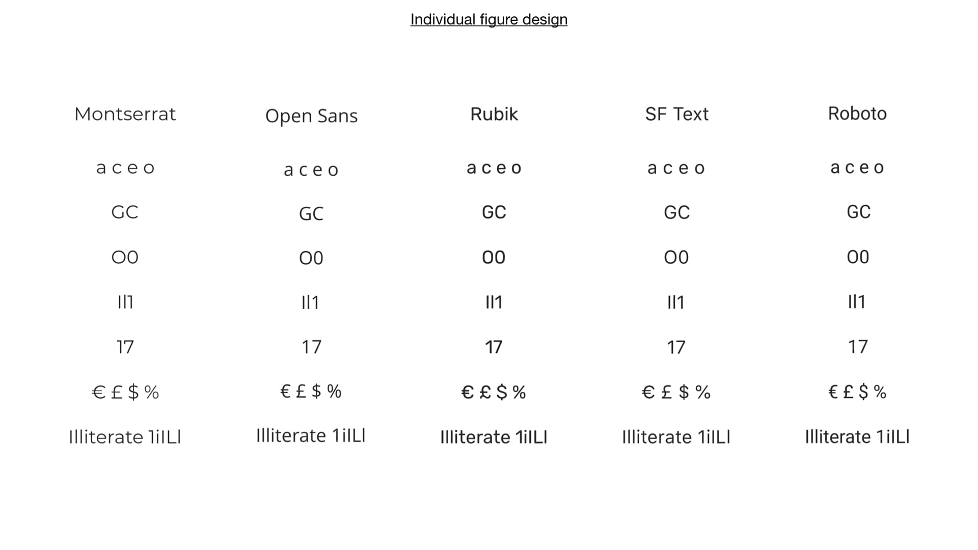
- Individual figure design
- It doesn’t attract attention. The focus is letting users get things done (important consideration for enterprise software).
Current font
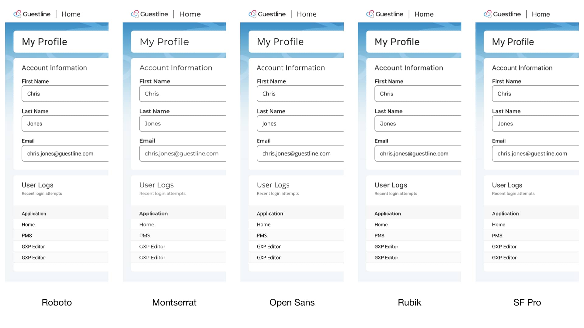
Montserrat was the font used for most of the branding. Type analysis revealed that it does not perform very well as a web application font. Its characters are not easily distinguishable, and its numbers are not mono-spaced. Open Sans was therefore recomended as an alternative for body content as it ticks all the boxes of a good readable font.

Internationalisation Analysis
How do different fonts impact multi-lingual sites?
Where space is a premium selecting the wrong font can cause usability issues, impact development and make designing interfaces more challenging.
The Montserrat font consistently took up more space than Open Sans. Re-inforcing the postion of Open Sans as a better choice for the web application.

Colour Research
When your target users cover a wide spectrum, and that audience is using an application for extended lengths of time, it’s important to consider how aspects such as colour make them feel.
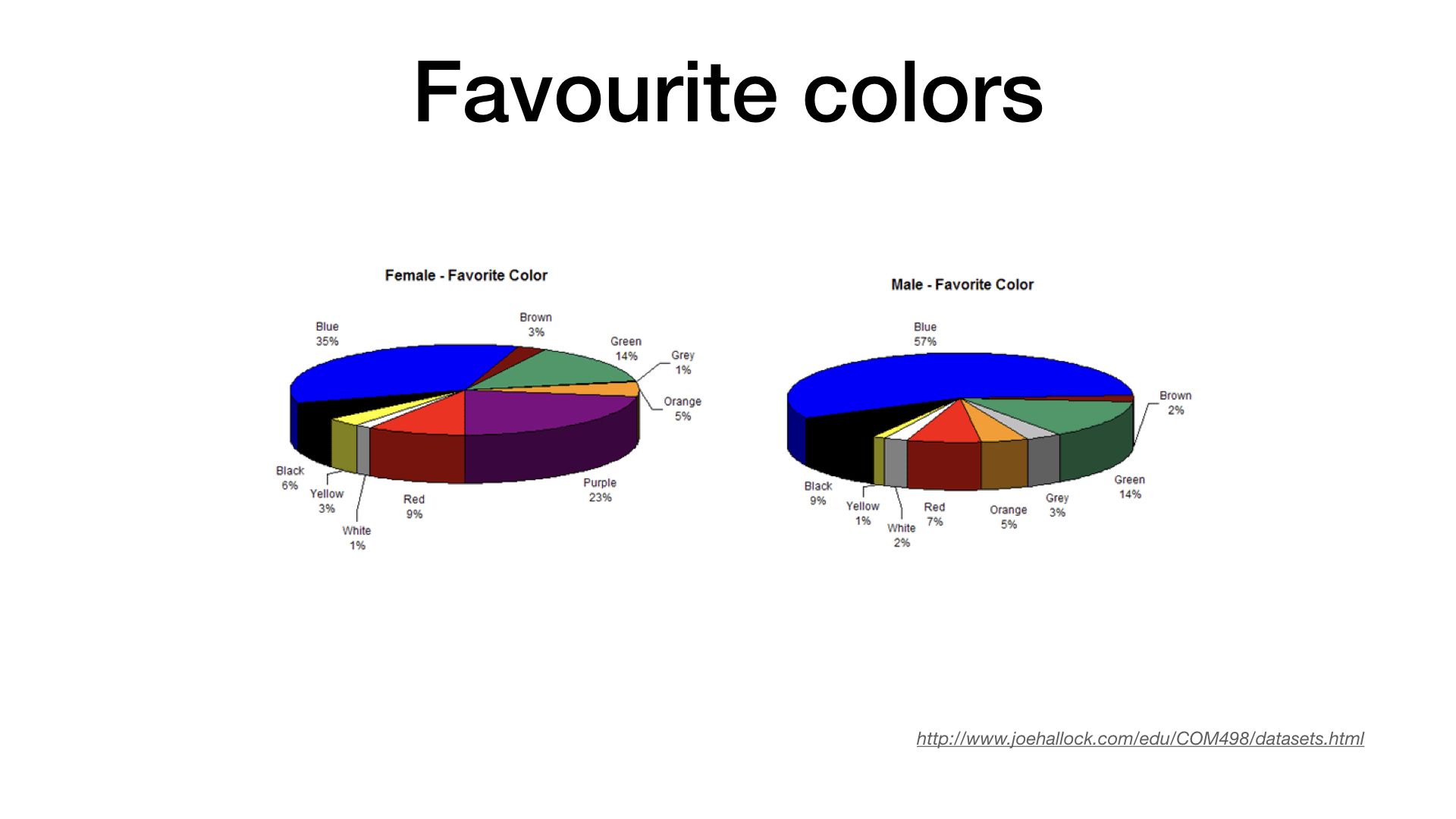
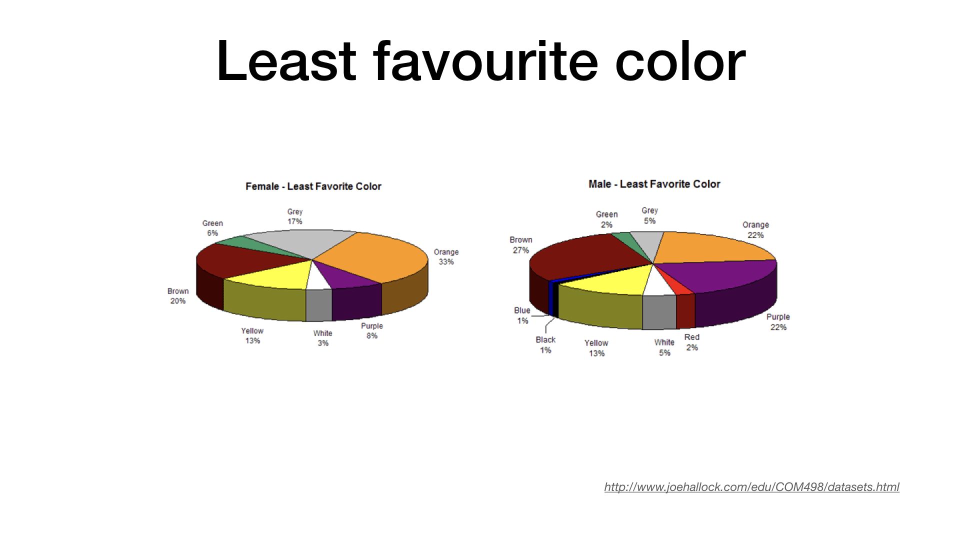
Research revealed how different colours are perceived. Blue is perceived to be a favourite colour for a majority of people. Blue was also one of three main colours in the companies branding. It was therefore chosen as the primary colour for the web application.
Accessibility Analysis
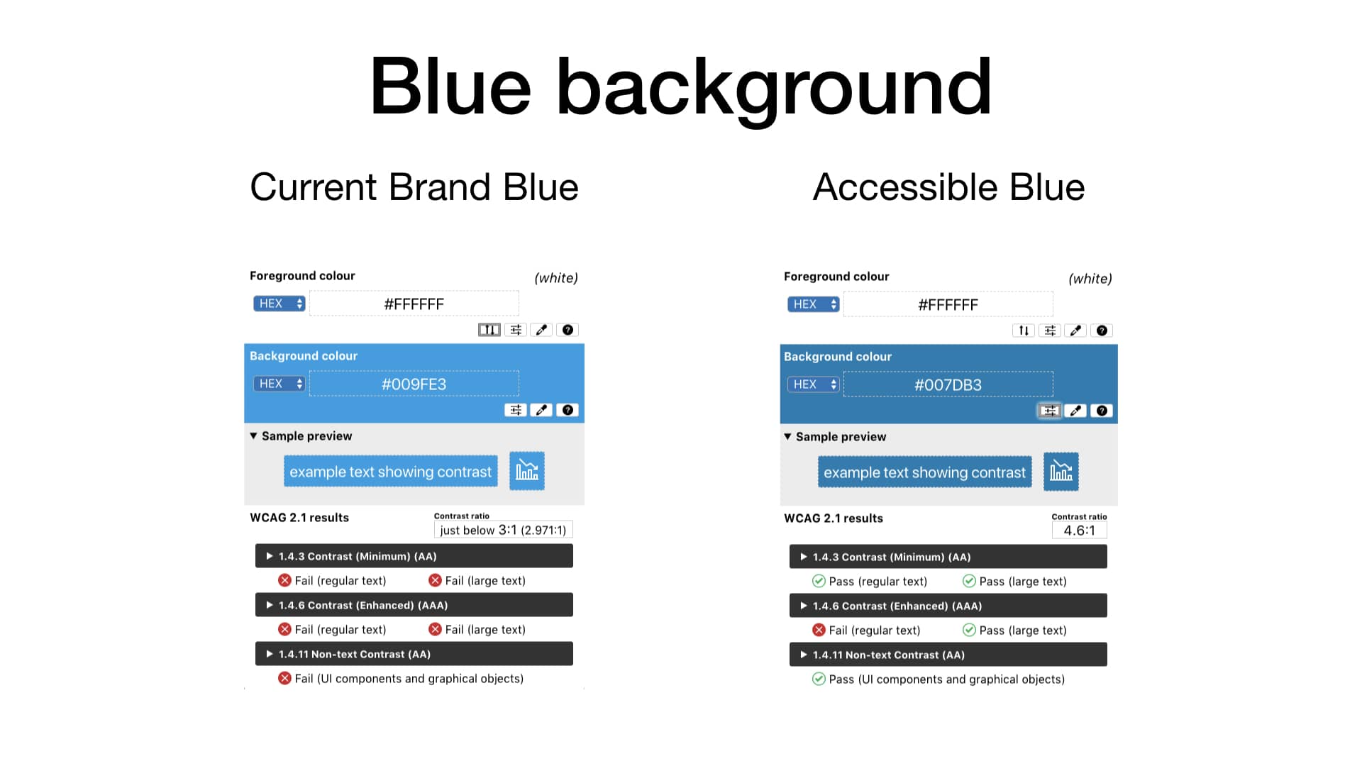
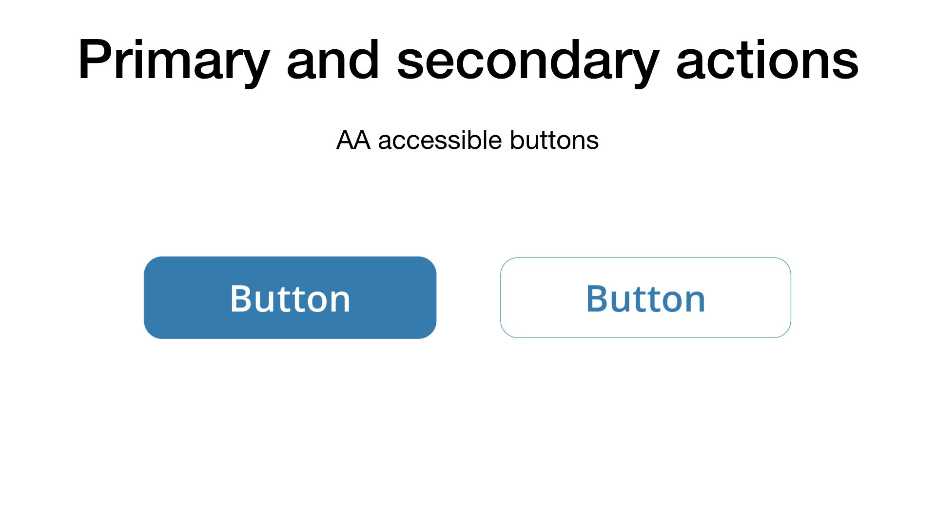
It was important to make sure the functions of the application were readable and accessible. Accessibility analysis of the blue colour in the company branding revealed that it did not pass the minimum accessibility requirements.
The blue colour was therefore adjusted to bring it inline with AA accessible standards so that it could be used for the web.
Hi-Fi Mockups
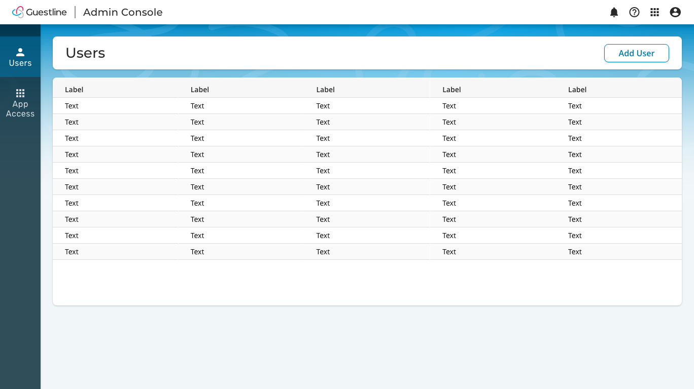
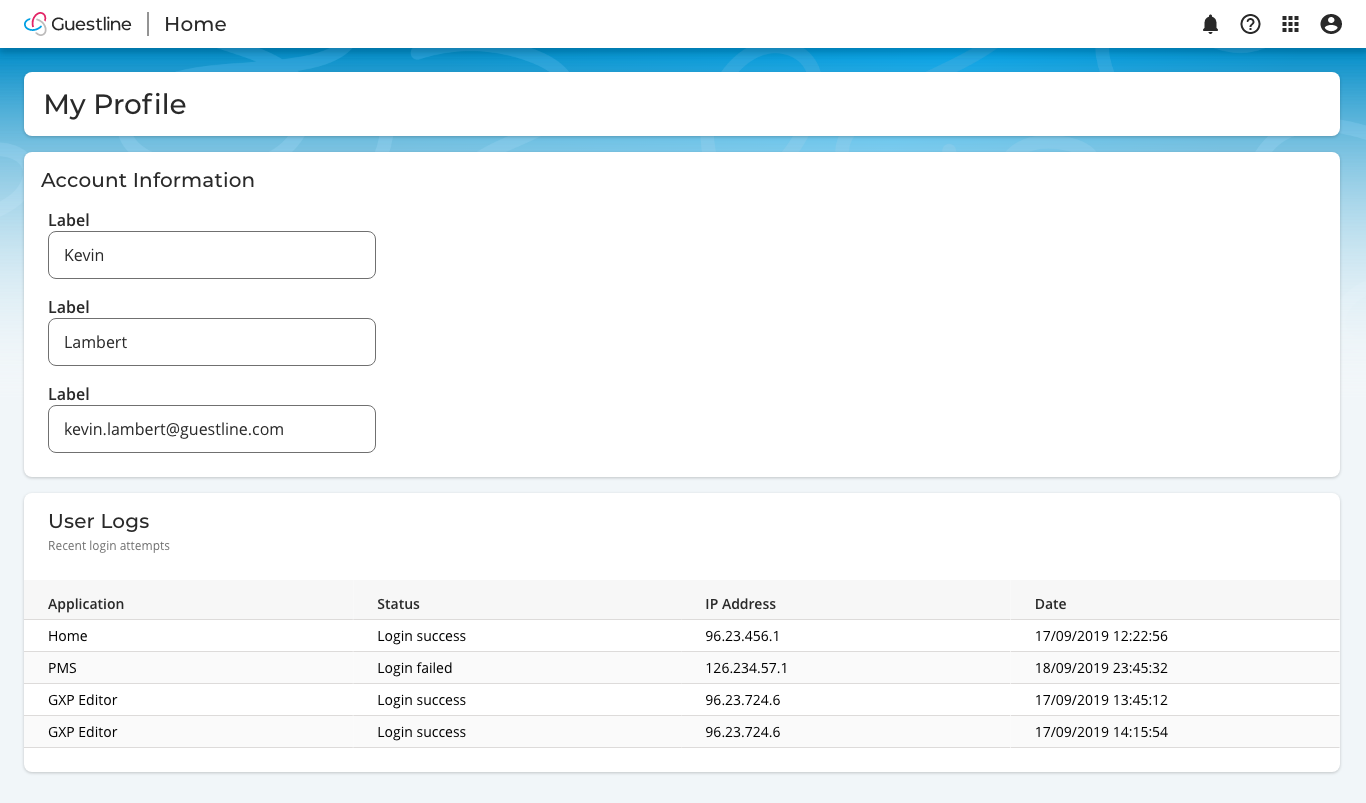
Visual design concepts were developed by creating mockups of what screens could look like and how design elements fit together.

Animation
Animation for the opening launch screen was designed. Aspects such as timing and movement that draw attention were carefully taken into consideration. Scrolling numbers and moving bar charts draw the user’s attention to important data, while application icons fade in subtly.
Design Reasons
Rounded corners
Rounded corners bring the focus inward. This brings attention to the center of buttons and panels. Round corners are also experienced as being friendlier, which is an important aspect in the hospitality industry.
Sharp edges/corners in contrast tend to make the user think more. For instance, the UK government website uses sharp corners.
The buttons and input fields were designed with a combination of both straight edges and rounded corners. Wanting the user to think before pressing a button while also conveying a softer, friendlier feel.
Background brand band
The background blue band was designed to make the panels stand out and be more defined. The soft snake-like waves in the background subtly allude to the branding and logo.
Labels and input fields
Labels above input fields were chosen as this allows for easier data entry. In contrast labels next to input fields allow for easier scanning of data.
Placeholder text were not used. Users can mistaken the placeholder text as data already entered. In high data density applications it is especially important to mitigate against this.
Style Guide
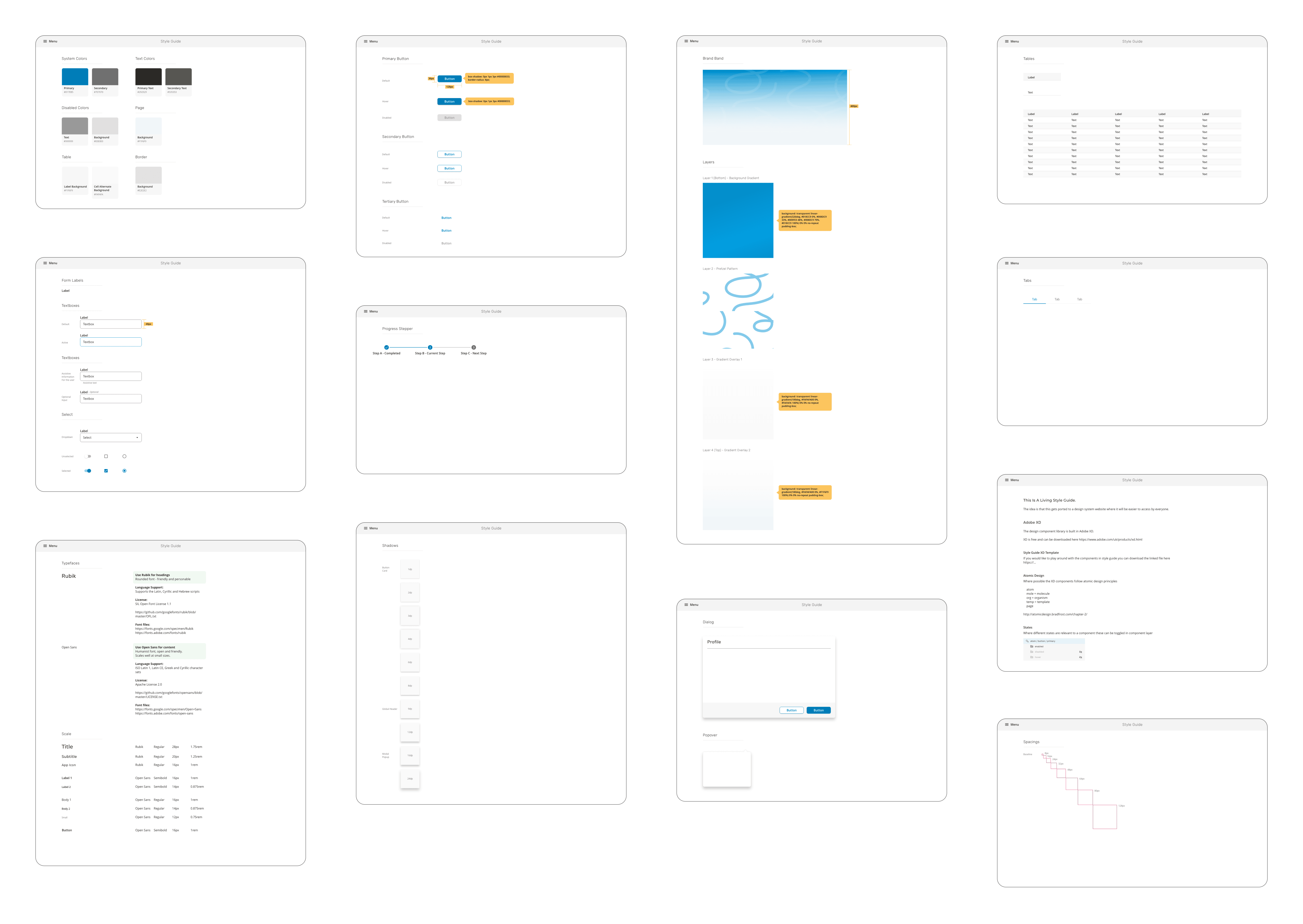
Using atomic design principles and based on material design, a style guide was created as a reference point for the organisation.
An Adobe XD component library was created that would allow the generation of quick mockups. different states such as enabled, disabled and hover were structured so that these could be easily toggled.
