AHEEN
Visual Design | Style Guide | Graphic Design |
WordPress | Adobe XD
Every story needs to be woven to captivate its intended audience. Creating visual elements and copy that help capture the essence of what this amazing organisation does. That’s what I aimed to do for AHEEN.
Overview
AHEEN is an organisation bringing together various contributors in the higher education sectors to provide education to refugees and displaced persons.
Problem
As a new organisation they needed a digital presence that would communicate their aims and purpose succinctly to their target audience. Other than a stock bought image of the African continent, they had no branding guidelines.
Solution
Developed the branding and visual style guide. Crafted a compelling story using UX copy and visuals to effectively convey the values and goals of the organisation to potential donors.
Process
Research
Branding & Style Guide
Visual Mockups
Writing UX Copy
Reviews
Revisions
WordPress implementation
Print Media – Brochure
Research
Interviews
I interviewed stakeholders to understand the ethos and culture of the organisation. What gets these stakeholders excited about what they are doing?
From the interviews I also gained access to existing documentation about the organisation.
The USP
From the interview and documentation, I was able to glean some of the core prinicples of the organisation and how it is differenciated from other organistions in the same sphere. Even though it was a non-profit there was “USP” – Unique Selling Standout Point
The USP was that it an African initiative aim at addresing the refugee education problem and not a Western/European initiative.
I created the core slogen:
An African initiative
Delivering African Solutions
Competitor research
While there weren’t “competitors” as such there were many organisations in the humanitarien sector that seek to partner with donors. I research other non-profit organisations to see thier approach and what their call to actions were.
UX Copy
Develop the call to action
Who are the primary target users?
The organisation was in the beginning stages, and the primary target audience were potential members who would wish to join the organisation as well as potential donors and observers.
What do we want them to do?
It was important to understand what we wanted people to do once they had visited the site. As the target audience were new partners, members/donors/observers, I created the call to action as “Find out more”. An invitation to potential contributors to join in a conversation with the organisation.
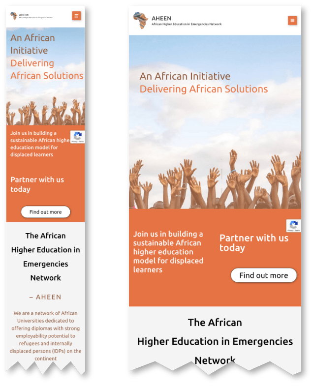
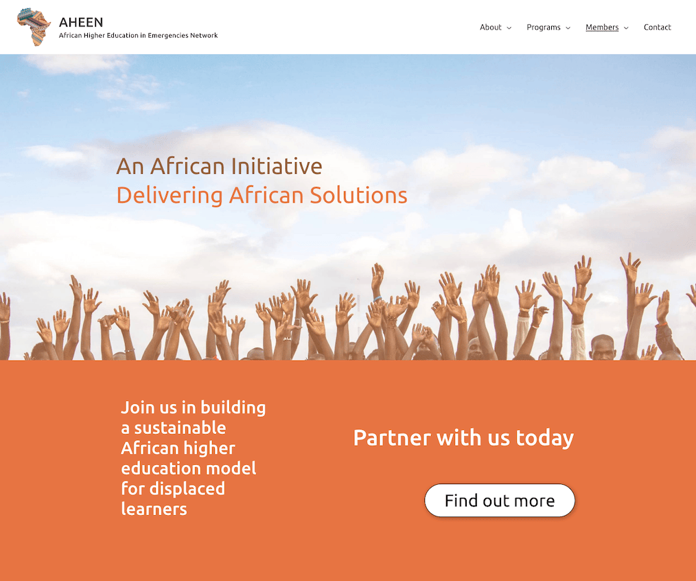
To capture the ethos of working together to tackle the challanges of education in emergency settings the leading copy “Join us in building a sustainable African higher education model for displaced learners” and “Partner with us today” was created
Branding & Style Guide
The organisation had bought an image of the African continent as their logo, but other than that, there were no branding or branding guidelines.
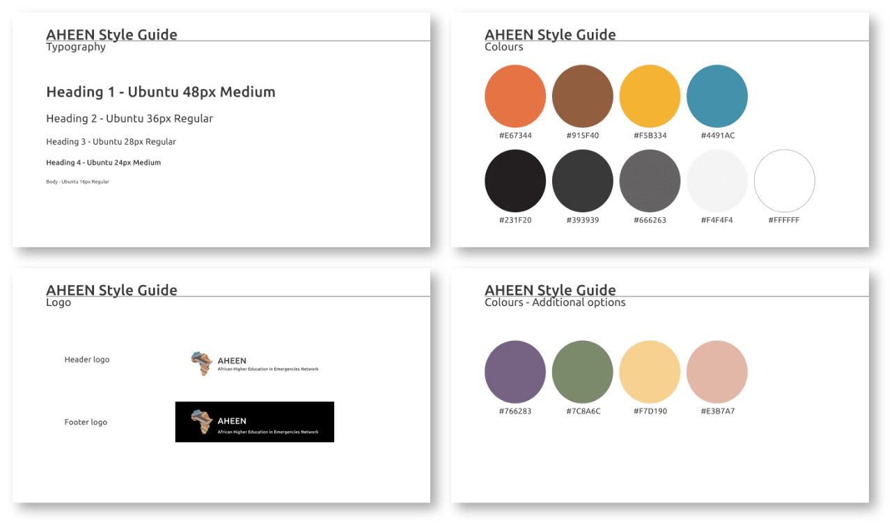
To bring consistency to the visual look and feel, a style guide needed to be developed. This involved extracting colours from the African continent logo and developing a palette that comprised primary, secondary and tertiary colours schemes. From a Typeface perspective, I chose the font Ubuntu for its readability in the digital field and also for its connection to the African continent. I designed typography hierarchy with varying sizing, weights and colours.
Visual Mockups – Design Elements
Conveying credibility
AHEEN needed to convey the weight behind the organisatino and that they were serious about tackling the challanges of education in emergency settings. Some of the existing partners where major universities in Africa, well know donor organisations such as Porticus and OSF, the European Commision as an observer. Finding a way to highlight the contributors would demonstrate the quality, level and weight of the organisation.
I designed a section that listed the various partners with their logos. Logos were converted to black and white to maintain colour focus on AHEEN’s messaging. The black and white logos also meant that no logo was highlighed more that others. This conveyed the message that contributors were of equal value – one doesn’t stand out more than the other.
Imagery
Images convey messages and emotions with out words. I wanted to choose images that highlighted the heart of the organisation and reinforced the call to action – partner with us.
Opening image – Hands in the air
This image captures the ethos of the organisation – education lifts up, allows one to reach for one’s dreams.
Closing image – Hand shaking:
Working hand-in-hand with different organisations is what enables AHEEN to have the impact it has in the refugee context.
WordPress
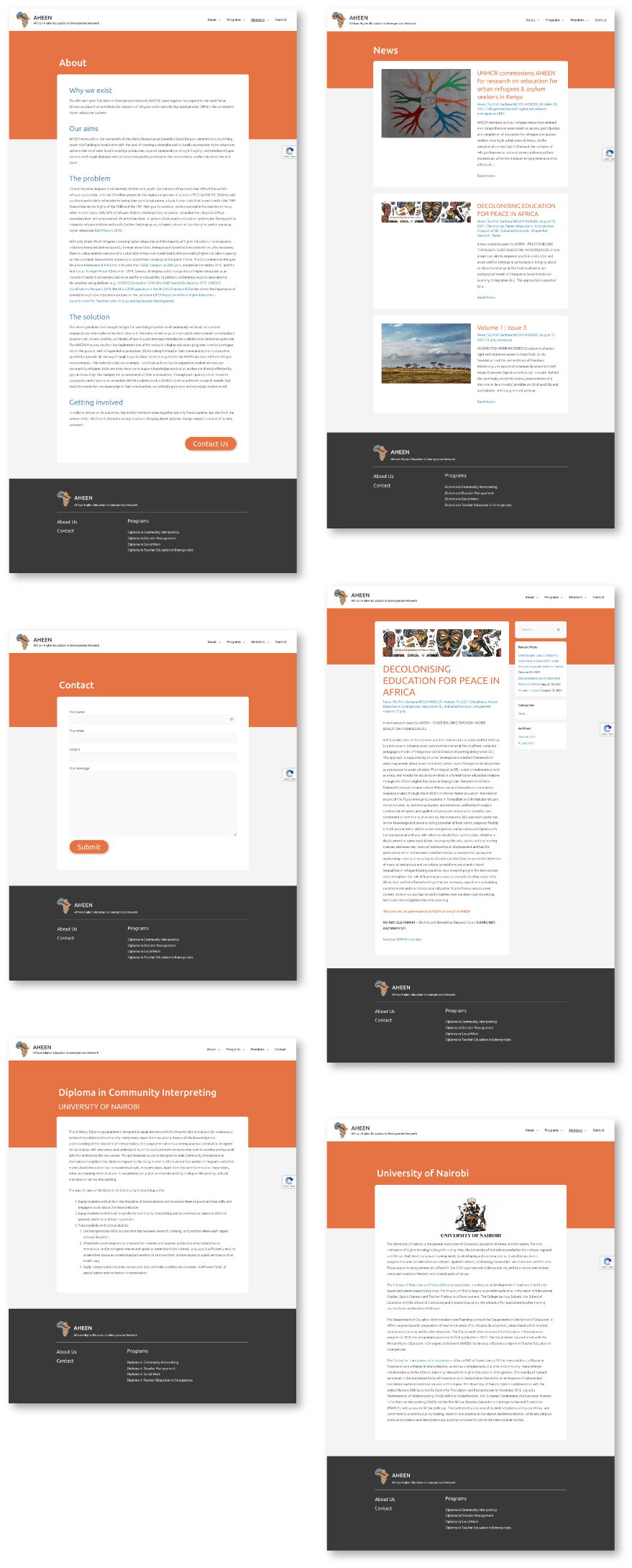
The design was implemented into WordPress using Elementor page builder and the Astra theme. A child theme was also created for custom CSS.
Performance optimisation was implemented to cache pages and combine CSS and JavaScript files. Images were compressed and optimised.
Basic SEO and sitemaps were created so that search engines could index the site properly.
Print Media – Brochure
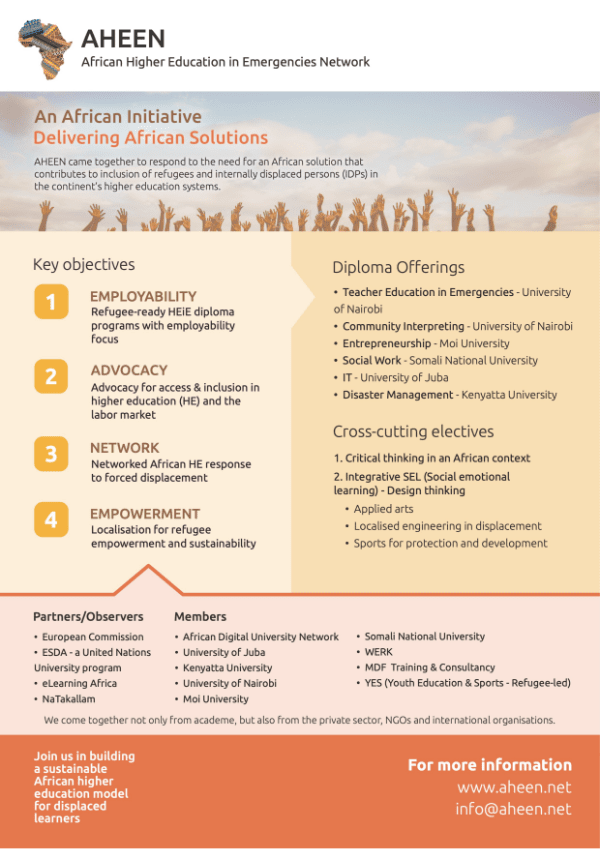
AHEEN needed a one-page brochure that contained their core information. This enables AHEEN to quickly convey their core aims and purpose to potential donors and contributors.
The arrows convey how partners and members contribute to the key objectives, and how the key objectives are supported by the diplomas and electives.

